1.9 KiB
| category | order | title |
|---|---|---|
| 十大原则 | 1 | Proximity |
When several items are in close proximity to each other, they become one visual unit rather than several separate units. Otherwise, their distance should be larger and look more like several visual units. The basic purpose of proximity is to organize. To give an apparent view of the page structure and the hierarchy of information to users.
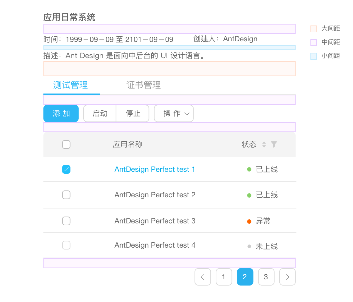
The relation of vertical spacing

Divide the hierarchy of information through three formats:『small spacing』, 『middle spacing』and『large spacing』

In the case that the three formats are not inapplicable, the hierarchy of information can be separated clearly through adding or cutting down the multiple of 『basic spacing』, or adding elements.
Note: in Ant Design, y=8+8*n, among which,n>=0,y stands for the vertical spacing and 8 represents 『basic spacing』.
Relationship of horizontal spacing

To adapt to screens of different sizes, in the horizontal direction, use grid layout to arrange the components to ensure the flexibility of the layout.

In the inner of a component, the horizontal spacing of elements should differ too.