---
category: Principles
order: 10
title: React Immediately
---
Invitations are powerful because they directly address discoverability and provide feedback before an interaction happens. Transitions are useful because they provide visual feedback during an interaction. But another class of feedback exists. It is the feedback that happens immediately after each interaction with the system, an immediate reaction paired with the user’s action.
While we can’t literally extend Newton’s law to the world of user interfaces, we certainly can apply this principle to the way we should interact with users. When users click on a button, they expect the button to depress. When they type in a field, they expect to see characters show up in the text box. When they make a mistake, they want the application to tell them where they goofed.
While there is a possibility of too much feedback (or, more accurately, too much of the wrong feedback—a concept we will discuss in the upcoming chapters), a system with little or no feedback feels sluggish and thickheaded.
> ** Newton’s Third Law of Motion **: For every action, there is an equal and opposite reaction, from Wikipedia.
---
## Lookup Patterns
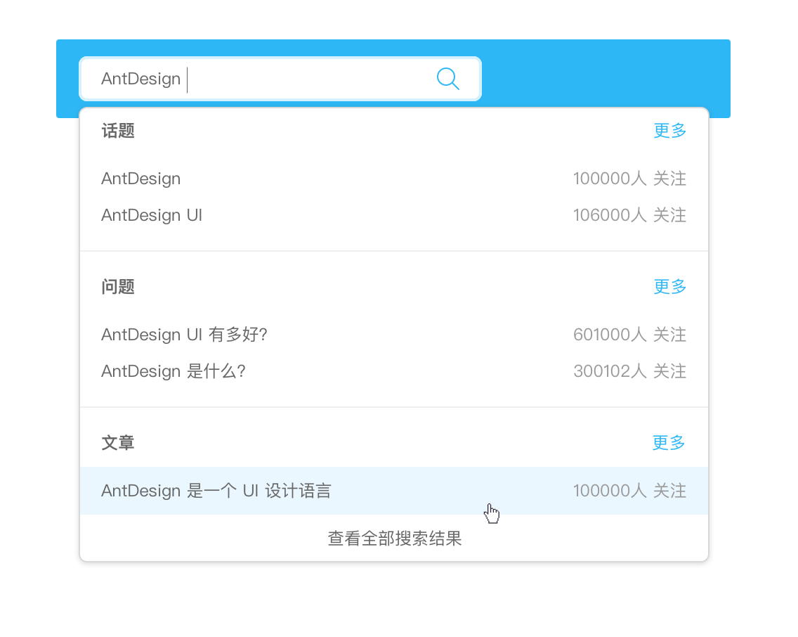
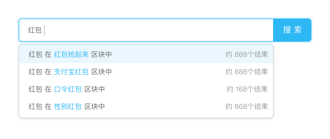 Auto Complete: As the user types input into a field, a drop-down menu of matching values is displayed.
Depending on the categories of search results, it can be divided into two types, Certain Category and Uncertain Category.
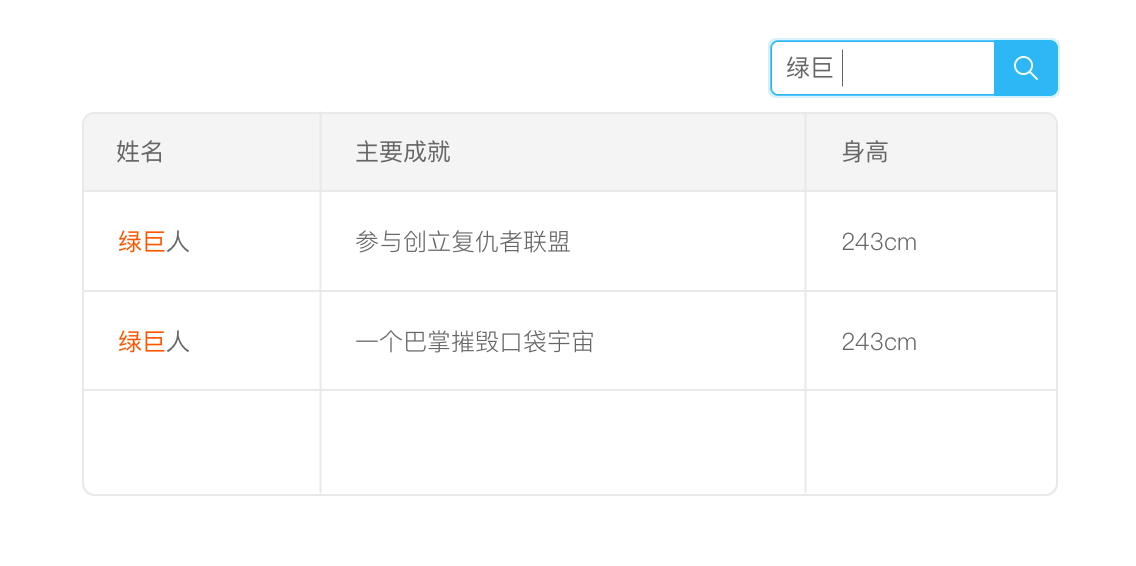 Live Suggest: Live Suggest provides real-time search term suggestions for creating a search.
Refining Search: Refining Search provides a set of live filters that allow the search results to be tuned in real time. Learn more on [Pattern/Advanced Search](/docs/pattern/advanced-search).
---
## Live Suggest
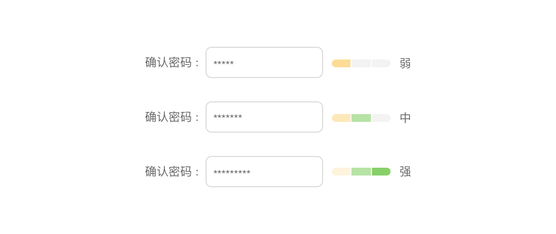 Live Preview: A Live Preview gives the users a glimpse beforehand of how the application will interpret their input once submitted.
>Note: An ounce of prevention is worth a pound of cure. Use Live Previews to prevent errors.
Progressive Disclosure: When users are faced with a series of steps, it is often best to provide hints only when they are needed, instead of cluttering the interface by displaying all the hints at once. Learn more cases on [Stay on the Page/Progressive Disclosure](/docs/spec/stay#Process-Flows)。

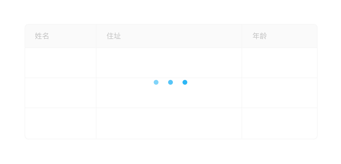

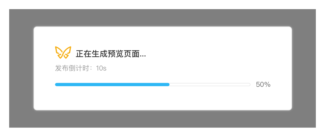 Progress Indicator: Progress Indicators keep a conversation going with the user when the rest of the interface is currently unavailable. Common Progress Indicators, such as Loading Button, Loading Table, Loading List and Loading Page, can be displayed respectively according to the frequency and importance of operation.
 Click Refresh: Click Refresh notifies the user of fresh content and provides button or tool to refresh.
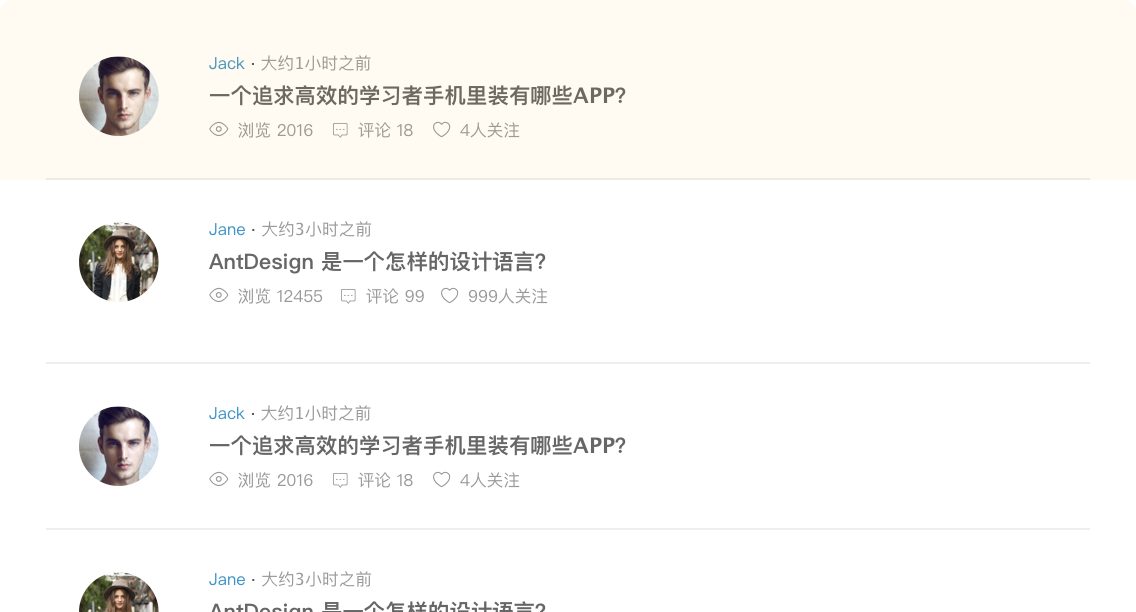 Periodic Refresh: Periodic Refresh brings in fresh content on a periodic basis without direct user interaction.

 Auto Complete: As the user types input into a field, a drop-down menu of matching values is displayed.
Depending on the categories of search results, it can be divided into two types, Certain Category and Uncertain Category.
 Live Suggest: Live Suggest provides real-time search term suggestions for creating a search.
 Live Preview: A Live Preview gives the users a glimpse beforehand of how the application will interpret their input once submitted.
>Note: An ounce of prevention is worth a pound of cure. Use Live Previews to prevent errors.


 Progress Indicator: Progress Indicators keep a conversation going with the user when the rest of the interface is currently unavailable. Common Progress Indicators, such as Loading Button, Loading Table, Loading List and Loading Page, can be displayed respectively according to the frequency and importance of operation.
 Click Refresh: Click Refresh notifies the user of fresh content and provides button or tool to refresh.
 Periodic Refresh: Periodic Refresh brings in fresh content on a periodic basis without direct user interaction.