---
category: 十大原则
order: 2
title: Alignment
---
As is described in the Law of Continuity of Gestalt psychology, in the perceptual process, people usually tend to understand the object in the way that it is firstly perceived, to let the straight lines be straight and let the curve lines be curve. In the design of interface, aligning the elements meets users’ perception, also delivers the information to users in a more smooth way.
> ** Gestalt psychology or gestaltism(German:Gestalttheorie)** :Gestalttheorie is an important genre of psychology. It rose in the beginning of the 20 century in Germany.The central principle of gestalt psychology is that the mind forms a global whole with self-organizing tendencies.『The whole is other than the sum of the parts.』--Quote from Wikipedia
---
## Text Alignment

 If the paragraphs or the length of the words are too short or too loose, then a unified visual starting point is needed.
---
## Form Alignment
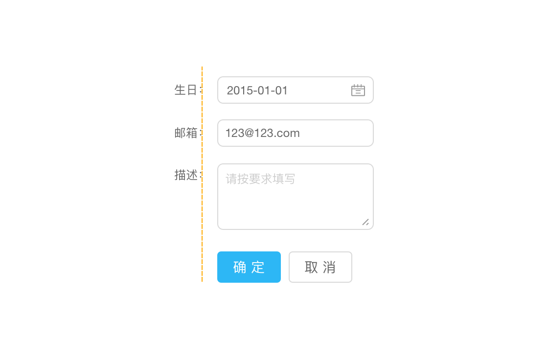 Colon alignment(right-align) can encircle the content into a certain range. Users can infer where the chart is through the regular arranged colon so that the speed of filling in the chart can be speeded up.
More ways of aligning,please visit [(/docs/pattern/form#对齐方式)](/docs/pattern/form#对齐方式)。
---
## Numbers Alignment
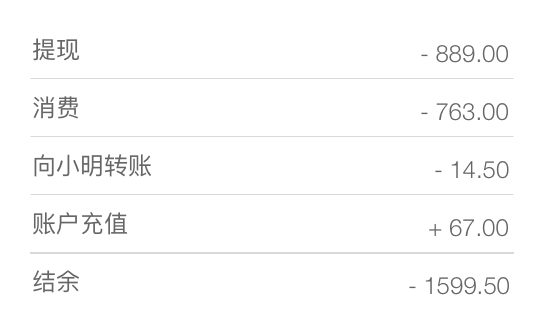
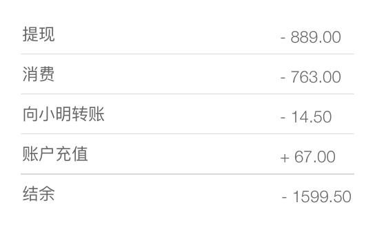 To compare the numbers faster, we suggest that all numbers should keep the same digit numbers after decimal point; meanwhile all numbers should be right-aligned. 。

 If the paragraphs or the length of the words are too short or too loose, then a unified visual starting point is needed.
---
## Form Alignment
 Colon alignment(right-align) can encircle the content into a certain range. Users can infer where the chart is through the regular arranged colon so that the speed of filling in the chart can be speeded up.
More ways of aligning,please visit [(/docs/pattern/form#对齐方式)](/docs/pattern/form#对齐方式)。
---
## Numbers Alignment

 To compare the numbers faster, we suggest that all numbers should keep the same digit numbers after decimal point; meanwhile all numbers should be right-aligned. 。