|
Side Navigation |
Top Navigation |
| Pros |
Hierarchy is easily extensible; Make room for page content horizontally; Allow fixed position, so that user can navigate to intended page quickly. |
Conform to common human habit of browsing top-down, easy to browse and click; Content area usually stay in a fixed width (i.e. 1208px), so page layout is stabler and less sensitive to screen sizes. |
| Cons |
Sensitive to screen sizes because content area usually resides in a Grid. |
At present, most monitors are widescreen, so top navigation occupies a large area of valuable vertical space while waste a lot of horizontal space; Number and title length of menu items are limited. |
| Summary |
Suitable for multi-level, operation intensive and dashboard-like web apps. |
Suitable for landing pages and consumer facing web apps. |
We categorize common navigation patterns into side and top navigations. Either has its own pros and cons, and should be chosen accordingly.
Examples for reference [Commonly Used Layout](/docs/spec/layout#docs-spec-layout-demo-top)。
## Side Navigation
---
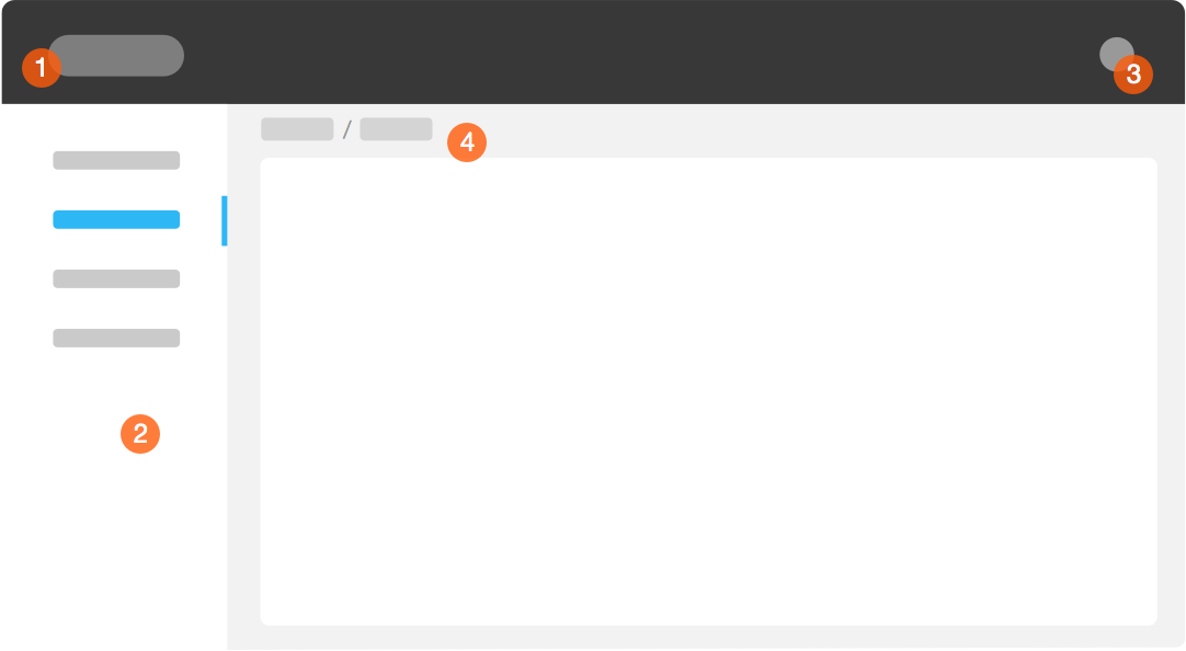 Navigational structure consists of following parts:
1. Product Logo and Name
2. Menu Items
3. Login
4. Breadcrumb (optional)
#### About Breadcrumb
> 1. Avoid using breadcrumb as much as you can, especially when page contains other navigation components sufficiently telling where users are.
> 2. Breadcrumb can be categorized as:
> - Path-Centric: dynamically showing a path of how user reaches current page
> - Position-Centric: usually fixed, showing position of current page among entire site structure
> - Property-Centric: showing categorical property of current page
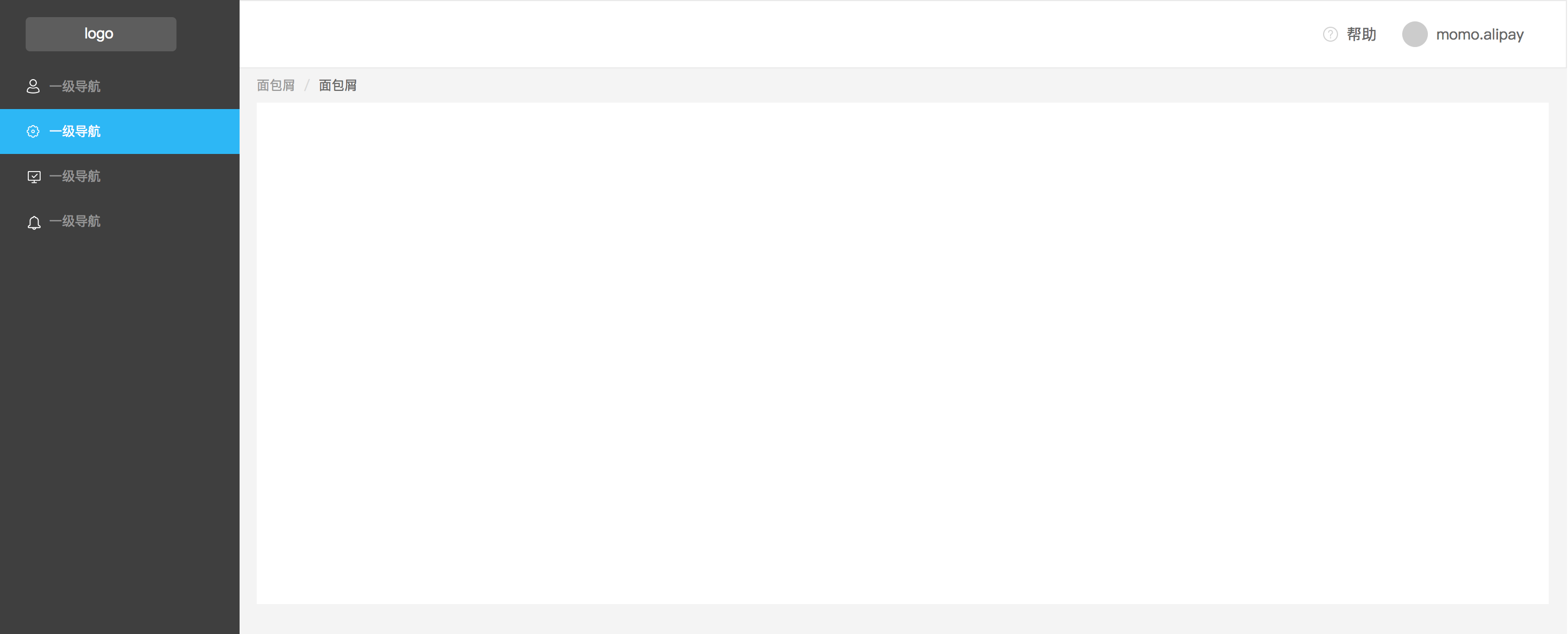
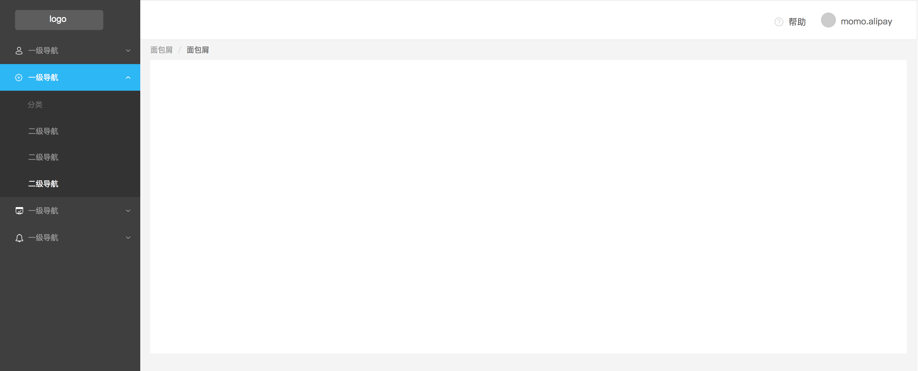
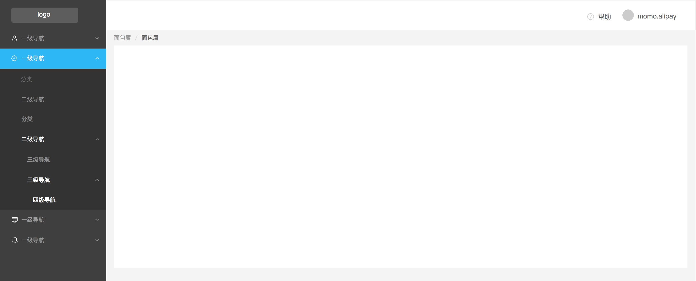 Here we provide navigation patterns for different kinds of menu hierarchy.
## Top Navigation
---
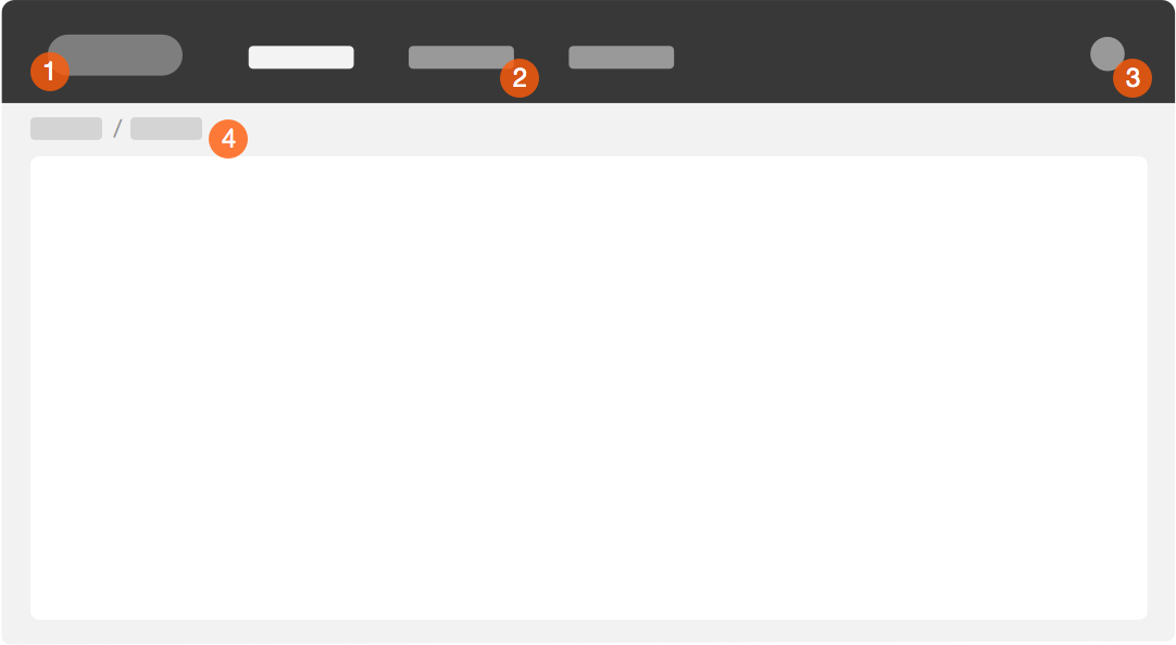 Navigational structure consists of following parts:
1. Product Logo and Name
2. Menu Items
3. Login
4. Breadcrumb (optional)
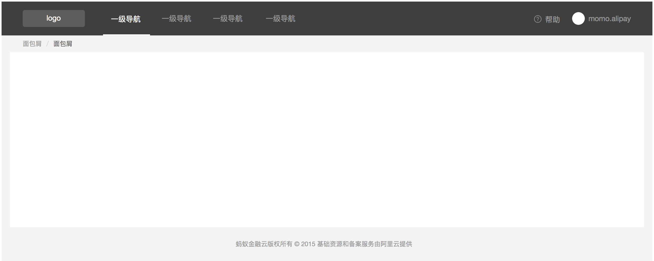
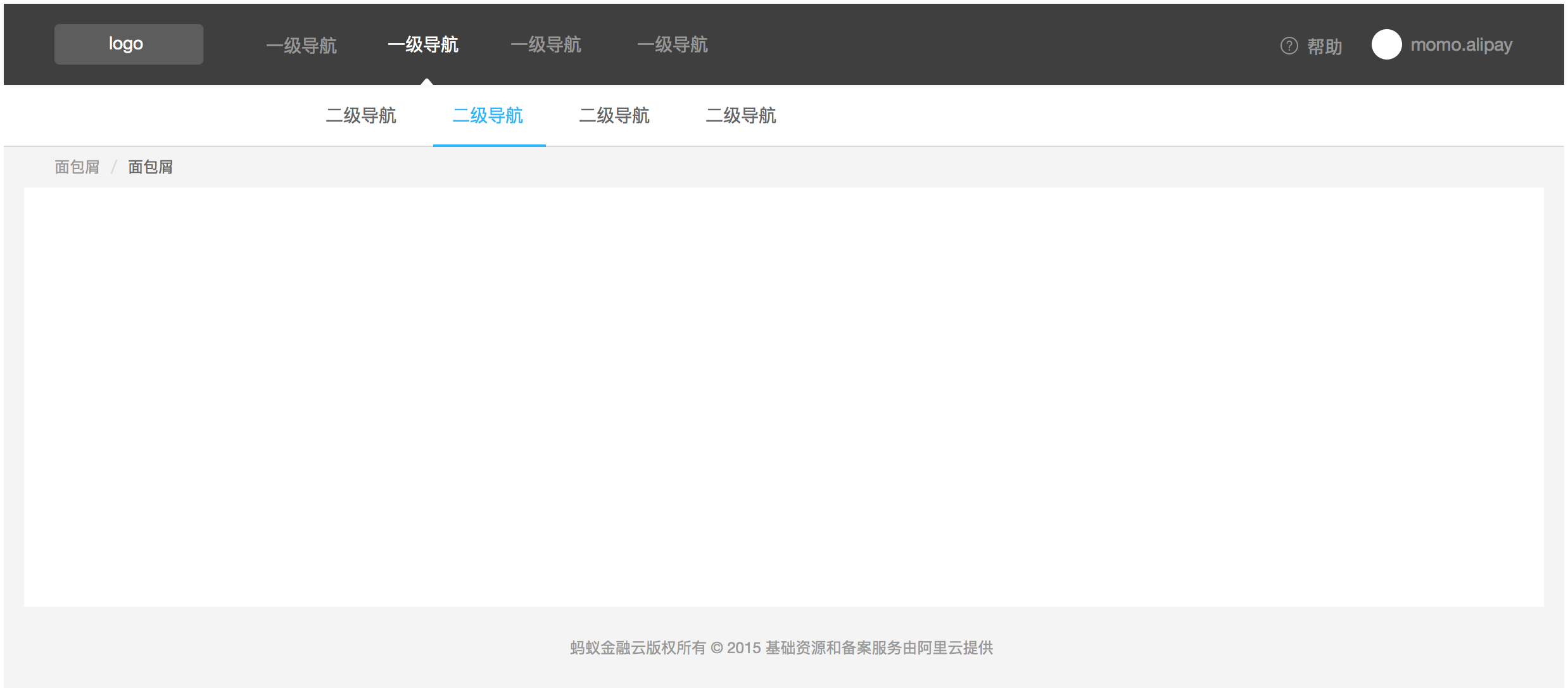
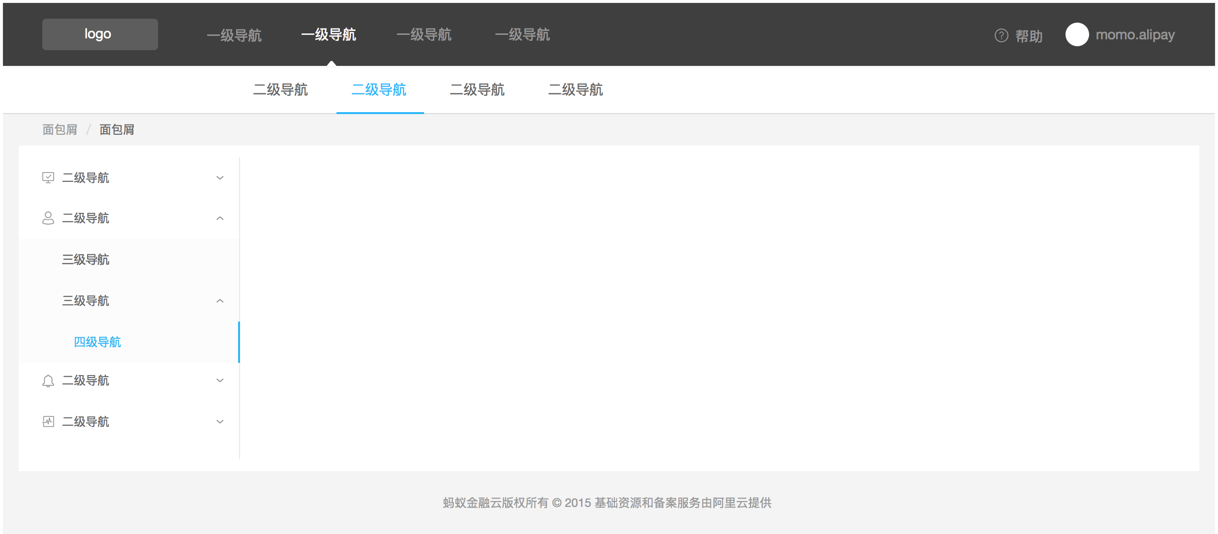 Multi-level Menu Items.